Why dual coding works in science
Of all the pedagogical tools that have become popular in the last few years, dual coding has proved one of the most divisive. Some teachers swear by it, drawing detailed diagrams under their visualiser every lesson. Others have warned it risks becoming little more than an ‘edu-fad’, one which takes up lots of time without really helping students to learn.
As with any tool — a screwdriver, a spanner, a knife — the key to dual coding is knowing when to use it and when not to use it. In my last blog, I argued that we need to understand the logical connections between concepts in each discipline if we are to avoid ‘lethal mutations’. Building on this idea, I hope to explain why dual coding is a very useful tool if you’re a science teacher but not much use at all if you teach history or English.
What is dual coding?
According to the Learning Scientists, who have been influential proponents of dual coding in the classroom, “Dual coding refers to the idea that we create separate memory traces for pictures and words. … This creates an additional mental pathway to the information, helping you remember it later.”
Their argument is that combining pictures with text is likely to boost memory. This is said to be useful both for students, when they are revising, and for teachers, who can provide diagrams to their students when explaining new concepts or summarising units of work.
The theory behind dual coding is often couched in terms of building schemas. According to the Learning Scientists, dual coding is particularly useful for developing connections between concepts. “If the concepts you are learning are highly interrelated, make one picture that includes as many concepts as you can incorporate. They can interact with each other or overlap here and there; any visual image of the information will do! [my emphasis]”
Dual coding or illustration?
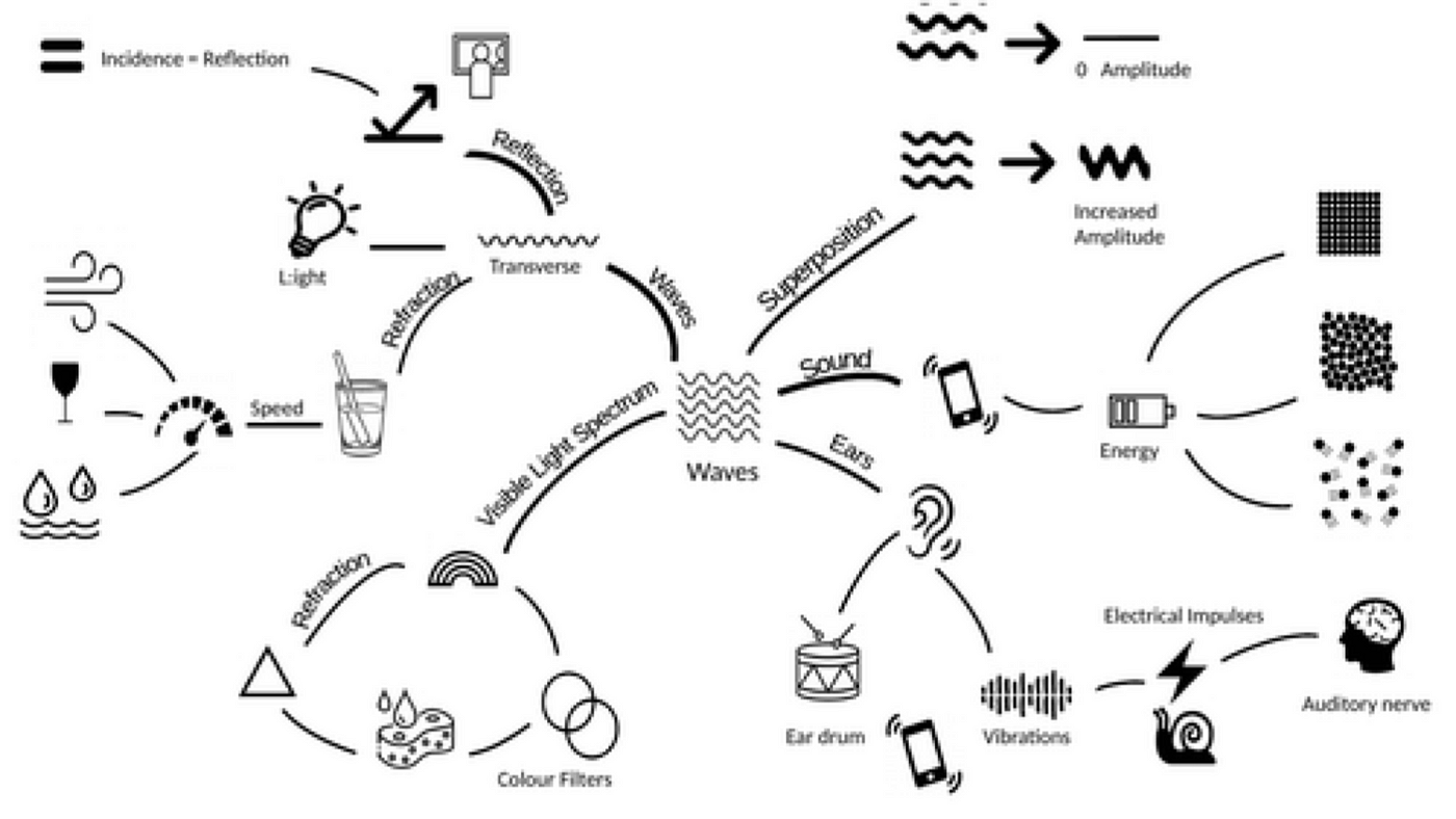
Their account implies that teachers should draw diagrams like the one above. This is what might be called a ‘concept map’ for the topic of waves, in physics. A series of words are linked together with pictures that supposedly create additional mental pathways to support memory. Hence, next to the word ‘energy’, we have a picture of a mobile phone battery indicator. Next to the words ‘ear drum’ we have a picture of a small drum.
You can probably sense my scepticism about the utility of diagrams like this. There are two problems. Firstly, it strikes me that most of these pictures offer little more than illustration. I find it hard to believe that adding pictures of a battery and a drum to the concepts of ‘energy’ and ‘ear drum’ makes it any more likely that students will remember how those concepts fit together. I would dispute the Learning Scientists’ claim that ‘any visual image of the information’ is likely to improve memory.
This leads to the second point. Like the diagrams in my previous blog, the connections between knowledge are represented as lines, but it is far from clear what these lines are referring to.
Most students already know that the concept of sound is somehow connected with the concept of energy, which is in turn somehow connected with the concept of particles. Yet unless they are already well-versed in the discipline, this diagram does not shed much light on the nature of those connections. It does not function as a pedagogical tool because it does not make explicit how these concepts are logically linked together.
Dual coding in science
This is where I put my cards on the table. I’m a dual coding evangelist. I rarely make it through a lesson without sketching something underneath the visualiser, and would encourage others to do the same. In that sense, I’m absolutely in agreement with the Learning Scientists’ advice: dual coding is definitely a Good Thing, for science teachers at least.
Where I differ is in my explanation of why I think it works, and this has important implications for practice. Whereas the Learning Scientists claim that any combination of picture and text creates ‘additional mental pathways’, I would argue that dual coding works in science because it allows us to represent the logical structure of scientific knowledge.
As I wrote about in an earlier blog, scientific knowledge can be thought of as developing via three steps. First, we guess. This guess takes the form of a picture: it is a visualisable image, what scientists call a model. Once we have our model, we make deductions. These are causal explanations of what we would expect to happen in a given scenario if our model was correct. “If x is true and I do y, then I would expect z to happen.” Finally, we check. This means carrying out an experiment to ascertain whether what was predicted by the model actually happens. If it does, then we can stick with the model. If not, then we need a new one.
Clearly, this is a simplified version of 600 years of intellectual history. Nevertheless, it can serve as a useful heuristic for thinking about the nature of scientific knowledge, and how such knowledge is different to that produced by artists, economists or historians.
It also helps explain why dual coding is of the most useful pedagogical devices in a science teacher’s toolbox. I’ve included some examples of dual coding from my own lessons to illustrate.
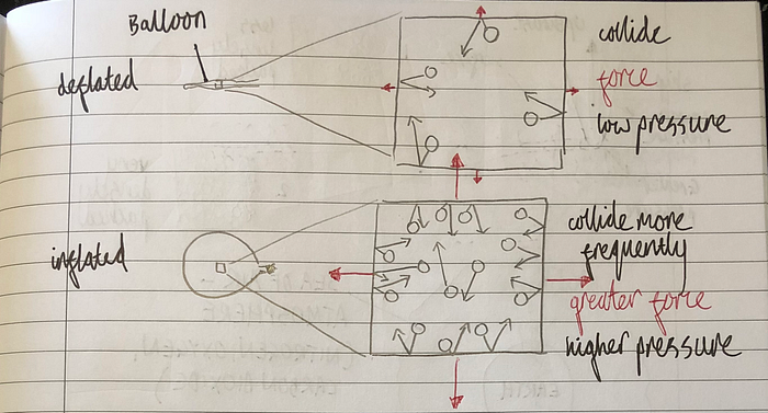
The first is from a Year 7 lesson on pressure in gases. The purpose of this lesson is to help students understand the link between the number of particles in a container and the pressure of the gas. I often use the example of a balloon, simply because this is something I expect all students to be familiar with. (Physicists may quibble with the fact that balloons have a variable volume but for Year 7 I’m happy to gloss.)
The first thing to notice about the diagrams is that they contain particles. Already, we are capturing something about how scientists seek to describe the world: the particle model is, as the name suggests, a model. Science teachers often begin their curriculum with this model because it is easy to visualise and a powerful generator of the kind of deductions which can be checked by experiment, as we shall see.
The second thing to notice is the layout, which can be thought of as a 2x2 grid. In the left hand column we see the deflated balloon and the inflated balloon. In the right hand column, we see the deductions that can be made in both cases if the particle model is assumed to be true. (While drawing this, I would ask students to imagine physically blowing the balloon up, in order that they could link this concrete phenomenon of blowing air with the abstract idea of increasing the number of particles.)
What’s important here is that the 2x2 grid serves to represent the deductive structure characteristic of scientific thinking. The diagrams can very easily be turned into the kind of sentences we use to make those deductions, e.g. “if more particles are added to the balloon, then they are likely to collide with the walls more frequently,” and so on.
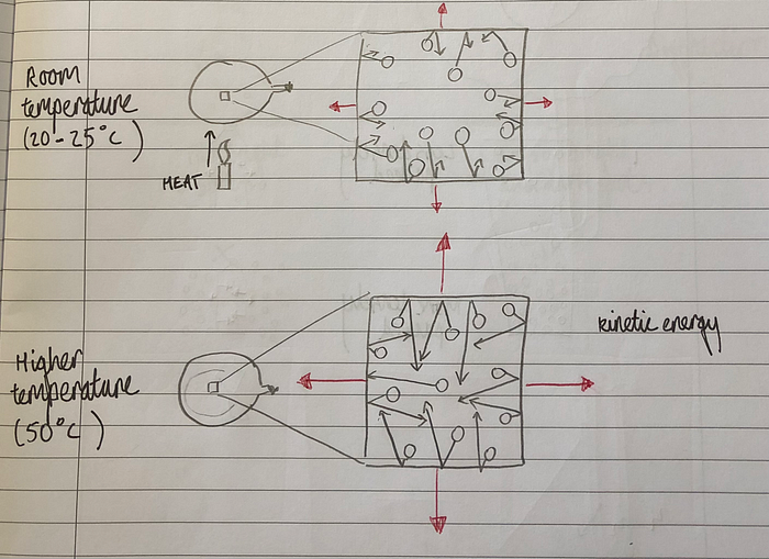
We can use similar diagrams to make further deductions, as in the following example, which makes explicit the link between the temperature of a gas and its pressure. The 2x2 grid is a visual manifestation of the argument that “if the gas is heated, the particles have a higher average kinetic energy,” and so on, a chain of reasoning that leads to the conclusion that temperature and pressure must be proportional.
Logical layout
The reason the particle model is so powerful is that dozens, if not hundreds, of images like the ones above can be drawn. The model can be used to make all sorts of predictions that can easily be verified or falsified by experiment.
The reason these diagrams are useful is that they make explicit how disparate ideas such as gas pressure, melting, convection and specific heat capacity are connected. They are connected because they can all be explained by making deductions from the particle model. The logical structure of scientific knowledge is captured as much by the layout of the diagrams as by their content.
The work being done by the diagrams in these cases is not, therefore, mere illustration. It surely disproves the claim that ‘any visual image of the information will do.” Dual coding will only work if the teacher’s diagram makes explicit the logical connections between concepts. Diagrams like the ones above act as scaffolds for scientific thinking: they are like writing frames without words.
This is why the kind of concept maps we saw in the first example are only likely to be useful to someone already well-versed in the discipline. What is represented by the lines in those diagrams is actually a chain of causal reasoning, a series of if … then … statements, each of which follows from the one before.
The aim of our work as teachers is to help students visualise the logic contained within those lines, to make explicit those implicit logical connections. Pictures are useful in science because scientists invent pictures of the world. The grid layout is useful because it captures the deductive process inherent in scientific reasoning.
Dual coding in other subjects
Interestingly, one of the papers quoted by the Learning Scientists uses scientific concepts in its experiment: “students studied an animation depicting the operation of a bicycle tire pump or an automobile braking system.” The example of a bicycle tyre is almost identical to that of a balloon shared above.
There is therefore an evidence base to suggest that dual coding works in science, even if there remains some discussion as to the reasons why drawing pictures can be effective. As we shall see in my next blog, however, knowledge in other subjects (e.g. history, English) has a very different logical structure. This means dual coding is not always the best way to make explicit the connections between concepts in those subjects.